

Challenge or Problem Overview
The primary challenge identified through user research is the inefficiency and inconvenience customers face when attempting to book and manage car maintenance services. The core issues include unpredictable service duration, unclear pricing, and limited appointment availability, all of which contribute to a frustrating and uncertain customer experience. For many users, the inability to anticipate how long a service will take or how much it will cost until completion results in a lack of trust and dissatisfaction.
In addition to these pain points, users expressed a strong desire for digital solutions. particularly a mobile app that could streamline the service experience. They specifically sought features like real-time availability, appointment scheduling, and transparent pricing, emphasizing the need for time-saving and convenient options. However, concerns were also raised about the reliability of service providers connected through such platforms.
The users in this case study are vehicle owners who frequently rely on local workshops for routine maintenance. Their experiences point to a clear opportunity to enhance customer satisfaction through a mobile app that prioritizes clarity, convenience, and flexibility. key drivers of decision-making in this service space.

Discovery: Research & Analysis
To better understand car owners’ experiences with maintenance services, I conducted semi-structured interviews with four participants who regularly book such services. This qualitative approach helped uncover key pain points, expectations, and opportunities for improvement.
Participants described challenges such as long wait times, unpredictable service durations, unclear pricing, and limited availability. issues that create frustration and reduce trust. These insights revealed a strong demand for a mobile solution that simplifies the booking process, offers transparent pricing, real-time availability, and enhances convenience through features like pickup and drop-off services.
I visualized the results using an affinity diagram to group user concerns and expectations by theme. This helped identify five main focus areas for design: simplifying scheduling, increasing transparency, improving service reliability, offering optional pickup/drop-off, and supporting various payment methods.
This discovery phase shaped the direction of my design, ensuring it’s grounded in real user needs and expectations.
.jpg)
infinity diagram
Design: Concepts & Sketching
After completing the research phase, I gathered user notes from the interviews to clearly identify key pain points, needs, and expectations. Based on these insights, I began brainstorming core features that could directly address user frustrations.
I then sketched out user flows and interface layouts, which helped visualize the overall experience. This led to the creation of a low-fidelity digital prototype focused on the service booking process.
To evaluate the effectiveness of the design, I conducted a usability study, observed how users interacted with the prototype, and used the feedback to iterate and improve the design accordingly.
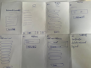

Paper Sketches


Feature Prioritization
Interview Notes
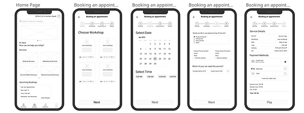
Digital Prototype - Iteration 1
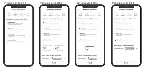
Digital Prototype - Iteration 2

User Flow
Develop: Prototyping
After defining the key user needs, I moved into building a functional prototype to test and validate the booking flow experience. The prototype was created in Figma, focusing on usability, clarity, and step-by-step guidance for users scheduling car maintenance services.

Select Date&Time Page
Test: Validation, Usability, Feedback
To ensure the app design met real user expectations and delivered a smooth, intuitive experience, I conducted a moderated usability test using the Lookback platform. The main goals were to:
● Validate the usability of the core booking flow.
● Identify any points of confusion or friction in the user journey.
● Collect real-time feedback on interface clarity and feature expectations.
Seven participants from diverse backgrounds tested the prototype. Their interactions, reactions, and verbal feedback were
recorded and analyzed to uncover meaningful insights.
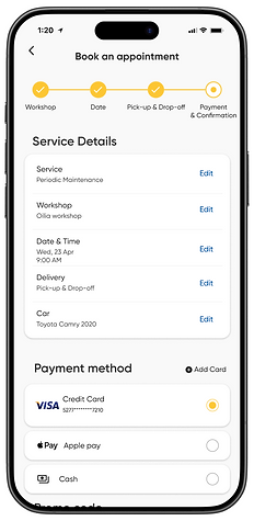
The test results confirmed several design choices but also revealed key areas for improvement. One important change made after the test was increasing flexibility by adding edit options to allow users to modify their selections more easily.
Design: Iteration
Based on usability testing insights, I improved the booking summary screen by adding edit options to enhance flexibility. This change helps users feel more confident and in control of their input, which increases the likelihood of completing their booking.

Before
After
Solution & Impact Overview
Based on usability testing feedback, I added "Edit" options on the booking summary screen, allowing users to review and adjust their input before final submission.
This improvement gave users a stronger sense of confidence and control, which reduced hesitation at the final step. Participants in usability tests were more likely to complete the booking flow without abandoning it. Feedback indicated higher satisfaction and perceived flexibility.
This project emphasized the importance of flexibility and transparency in user flows. By observing user behavior and iterating based on real feedback, I learned how small UI changes — like making fields editable — can significantly enhance the overall experience. In future projects, I’ll prioritize giving users more control, especially in multi-step tasks.

Before “Edit” option
After “Edit” option
Takeaways
Working on Ride Care allowed me to apply a full end-to-end UX process — from user research and problem discovery to ideation, wireframing, prototyping, and usability testing. Throughout the project, I utilized a range of skills including user interviews, task analysis, journey mapping, and high-fidelity prototyping in Figma.
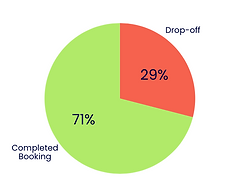
One of the most valuable insights came from usability testing: 29% of users dropped off at the booking summary screen, mainly due to unclear information and the absence of an "Edit" option. This left users feeling uncertain and out of control when reviewing their inputs.
To address this issue, I redesigned the summary screen to include clearly visible and accessible edit options, which significantly improved user confidence, reduced friction, and supported task completion.
A major challenge was balancing simplicity with functionality under time and scope constraints. It required making thoughtful trade-offs between adding helpful features and maintaining a clean, intuitive interface.
Ultimately, the final design succeeded in meeting the users’ core needs for clarity, flexibility, and control — contributing to a projected increase in booking completion rate from 71% to 86%. This outcome reflects a measurable improvement in usability and overall satisfaction, and aligns strongly with the project’s goal of reducing drop-off and optimizing the booking experience.